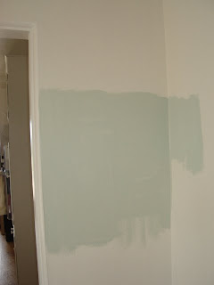
MrMartha has been suffering from Paint Paralysis the past ten days or so. It's a common but little studied malady that affects even the most ardent and color sure deadeyes among us.
It's that horrible chasm stretching in between "pretty much deciding on a paint chip" ------- and committing to having gallons of it mixed.
The more timid among us will opt to have some sample quarts mixed up and paint a bunch of test swatches -- drawing comfort (and perhaps insight) from this interim step. Not, however, those of us who take pride in knowing we can differentiate puce from cerise or heliotrope. With our eyes closed. In the middle of a bad dream.
MrMartha seems to have no trouble with puce vs cerise, especially since neither of those colors are in the palette for MidCentury Manor. The subtleties of turquoise, it would seem, are another matter. And, browns are absolutely deadly.
Luckily, MrMartha has an incredible local paint store, all they do is sell paint....no uber-chain--mega-mart-- home-improvement-supercenter--paint department for MrMartha. No way -- no how. The local option is always desirable, so long as it is quality and has competitive prices.
Today, MrMartha discovered that even with his proven history of dead reckoning skills, and a very sure eye -- one can never, never ever, trust a paint color to not be a complete surprise when it morphs from 4 square inches of chip, to a large expanse of surface.
Actually, it is not that bad. MrMartha was, in fact, right on the money with two of the colors, and got the third color right, just at the wrong intensity.
The fourth color, however, was so far out of the ballpark, that it's really making MrMartha's brain hurt a little bit just to have to write about it.
The other significant problem -- was an error by the paint store, though it took a bit of time and furrowed brow to figure out it was indeed NOT MrMartha's error, (and it is totally fixable).
Thus, our score, at the bottom of the 9th, with brushes loaded:
MrMartha: One home run, a second home run (when the paint store mistake is fixed), a strong triple, and the most heinous foul EVER.
Paint Store: One unforced error -- to be corrected.
Read More if you would like to know what MrMartha is going to do with all this paint!
As a child, MrMartha always wanted to grow up to name paint chips...it seemed way too much fun to have a job where you did nothing but look at colors and decide what to call them.
(Ambiguous Mushroom? White Hot Sand? Aubergine Over Easy?)
So, it has become a little personal quirk (among so many little personal quirks) for MrMartha to re-christen paint colors selected for projects with new titles.

At this point, the main living areas will be in a wonderful color that MrMartha is calling 'Carnation Leaf' ...a subtle grayed green that should behave like a cool tone in the summer, but still have a lot of warmth to it in the winter. It's a modernized variation on the classic slate green that was so common in mid century decorating.
The main Kitchen is still a bit of a gamble...when working with three strong distinct colors of vintage ceramic tile, the only thing that makes sense is to add three additional colors of paint. Well, it makes sense in MrMartha's world anyway.
At present, the plan is to paint the upper cabinets and ceiling a wonderful shade of cream that MrMartha is calling 'Latte Froth' (it's Ok to be cliche with paint names).
The walls will be a turquoise that is a slight departure from 'ToM (The other Martha) Signature Blue'. Unfortunately, while MrMartha picked a great color, it is too vibrant, so toning it down at 50% with white base should make it exactly right.
The lower cabinets were supposed to be a darkish gingerbread tone...but this is where we run into the big foul. The paint, as ordered, turned out to be sort of electric yellow ochre (filthy lying paint chip).
MrMartha didn't realize that there could be acid color earth tones...
but there you are.
With a little luck, the paint store can work their alchemy with a re-tint, and relax the panicky ochre hue into the rich 'Sticky Molasses' color MrMartha has a clear mental image of.
So, a few days and a lot of masking tape, and we will see how it all comes out....MrMartha will keep you posted. Cross your fingers.


